This article was originally published in the Brand Finance AMC Hospitals 2023.
In 2017, HA Roth Consulting was engaged to assist with a major rebrand of the Dana - Farber Cancer Institute.

Building a great brand in any category requires years of hard work, strong leadership and deep, sustained commitment to delivering consistent, best-of-class performance across every aspect of an organisation… most of which has little to do with physical “branding” itself. But successful, brand-led organisations all share a distinct, well-understood brand idea at their core and a disciplined respect for its application. All else emanates from this foundation and well-branded academic medical centres are no different.
What does make the branding challenge for hospital systems and, especially, academic medical centres, more difficult is their exceptional range of highly diverse audiences, technical service offerings and the complex, often disconnected departments, schools and physical environments they inhabit. They are a complicated synchronisation of moving parts that have usually evolved over time, encompassing legacy names, affiliations and sub-brands, centres and institutes, structures, processes, services, capital requisites, regulatory requirements, donor development, livery, signage, digital platforms and a myriad of other intricacies that all compete for resources and attention.
Branding obviously cannot solve all these organisational complexities, but it must understand and embrace them to help executives, doctors, nurses and staff coalesce around a strong, resonant brand idea and expression that inspires and differentiates. When effectively conceived and implemented, the resulting brand positioning, identity and visual system becomes the lens through which the organization builds its reputational strength and value.
Yet, given the many and varied components at work within most major, academic medical centres, maintaining brand discipline can be particularly hard and it is not uncommon for them to discover, over time and despite all good intentions, their branding has strayed far afield of its original conception. This invariably results in diffused impact, awareness and value and generally demands a return to the basics of brand building.
Such was the case with Dana-Farber Cancer Institute in 2017. Although widely recognised as one of the world’s most respected cancer research and clinical care institutions among oncologists and healthcare experts, it suffered very limited general awareness outside its native New England region. This was due to many factors, including the institution’s long heritage of prioritizing its resources into the quality of its science and patient care, but also because their branding had become increasingly diffuse over time. An example of just some of Dana-Farber’s former legacy brand relationships is illustrative:
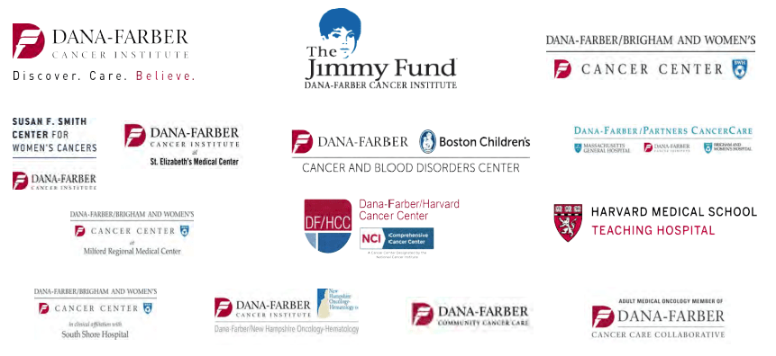
This lack of a cohesive brand expression undermined any Dana-Farber efforts to communicate a clear, consistent message to its target audiences of patients, referring and resident physicians, researchers and clinicians, caregivers, staff, vendors, affiliates, payers, government entities, donors and more.
Fortunately, new leadership at the organisation recognised the need for a “brand overhaul” and embarked on a comprehensive rebranding initiative. As with all successful branding projects, we started with information gathering, interviewing some 40 – 50 doctors and staff, including Nobel Prize winners, plus a competitive analysis of peer group branding and messaging. Months of work led us to two key conclusions: 1) Dana-Farber’s unique culture and organisational structure that fully integrates world-class cancer research and exceptional clinical care by physicians and specialists who deliver both, was a fundamentally differentiating approach to fighting and treating cancer. 2) The marketing and messaging for most healthcare organisations at that time was a virtual “sea of sameness” that begged for fresh thinking and creativity.
Building upon a brand platform that celebrated Dana-Farber’s distinctive approach to cancer research and clinical care (“from bench to bedside… and back again”), we explored a wide range of brand design ideas.
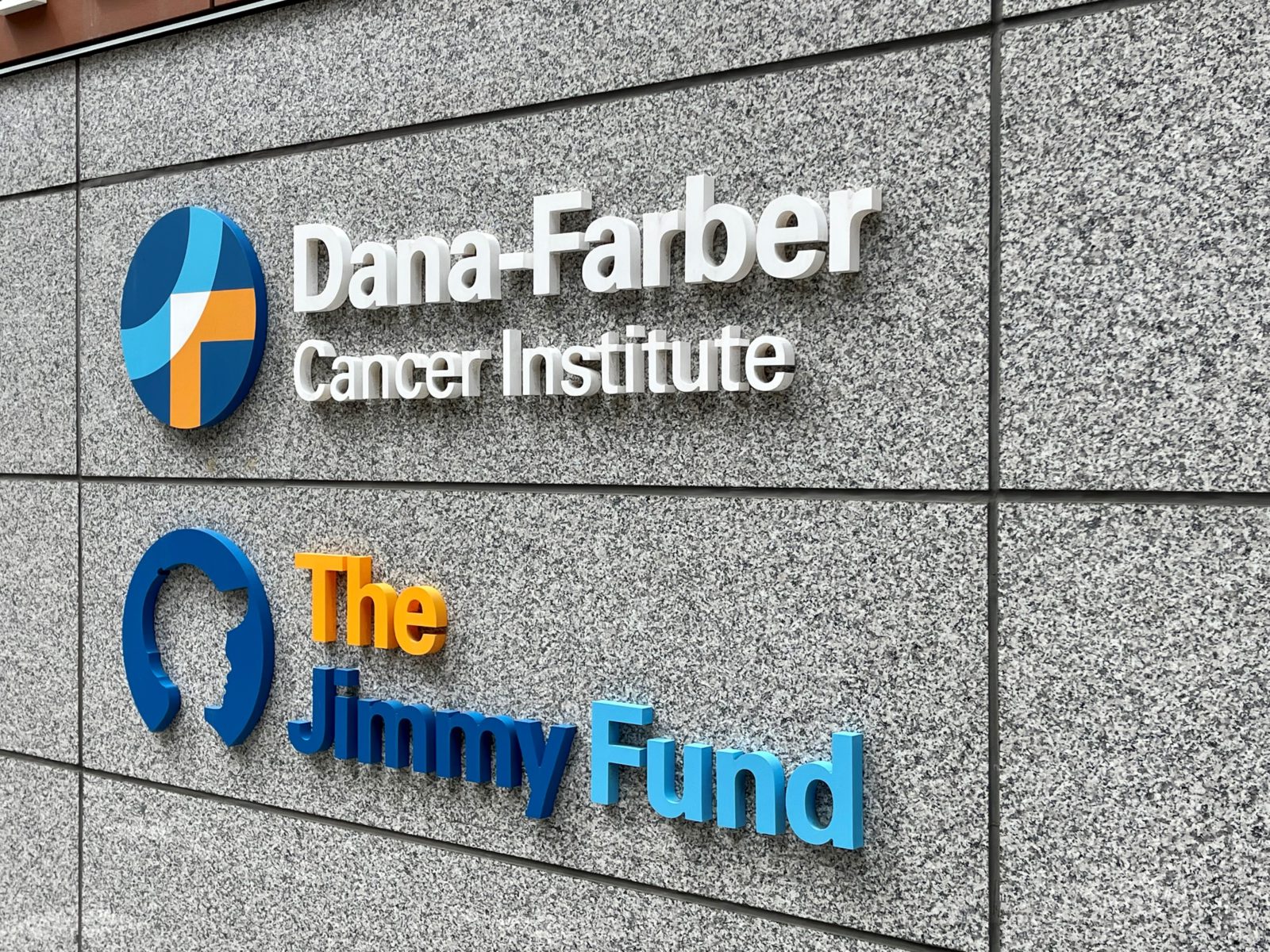
The result, after much consideration, is their new Dana-Farber “Lens” brand icon, which symbolises their fully integrated approach to science and care with its overlapping “D” and “F,” as if closely examined through a microscope. The central, white-space intersection where the two letters overlap is a direct allusion to the collaborative inspiration at the heart of all that Dana-Farber does.
Once their new identity had been established, our next task was to streamline and codify Dana-Farber’s brand architecture into a logical and cohesive structure. This is always a particular challenge with academic medical centres for reasons previously discussed and represented here:
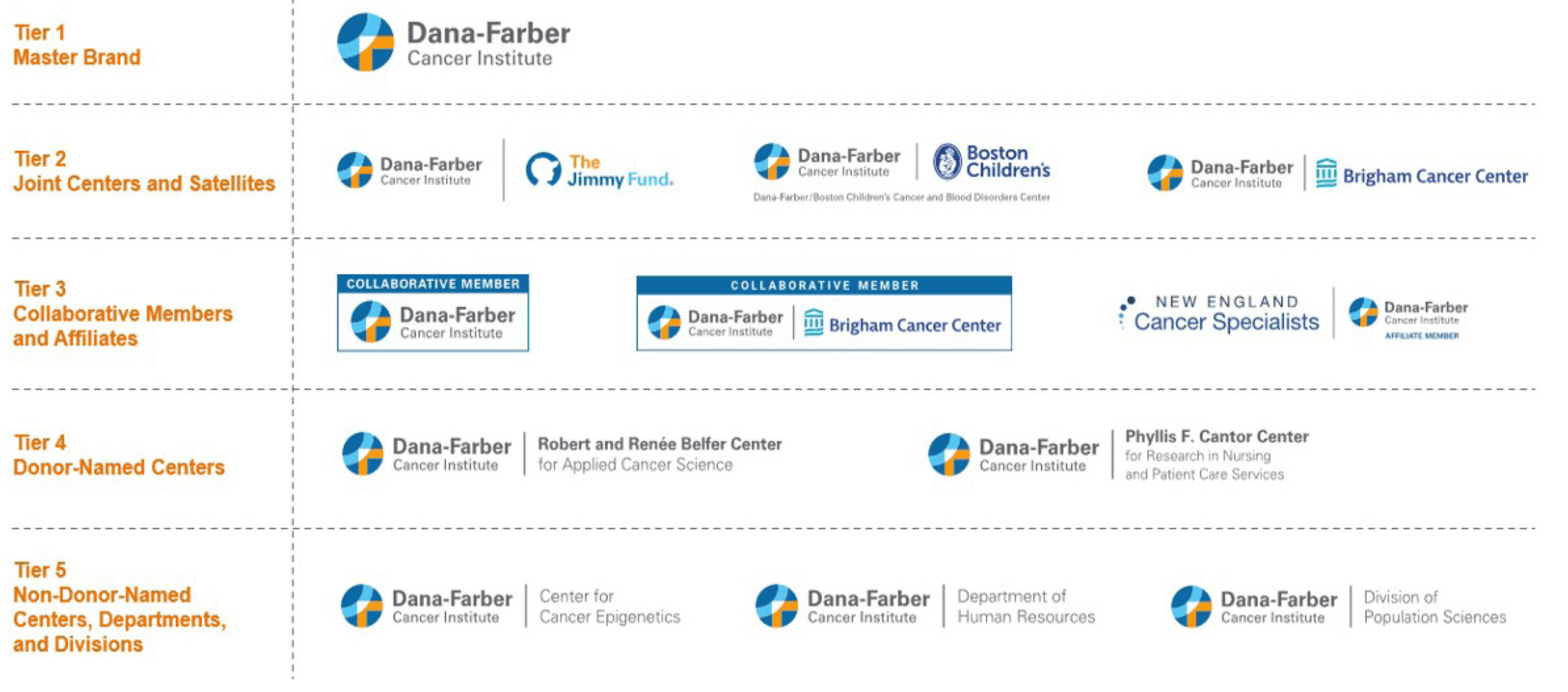
Discussions around brand architecture decisions can often be heated and even emotional as they inevitably lead to the “retirement” of legacy brand-like objects and signatures. But the over-arching branding priority for any world-class organisation should be to build upon the strength of its core brand signature and jettison virtually all competing logos and/or modified logo treatments. There can be only one core signature driving the brand— no modifications, adaptations or infringements permitted!
While important partnerships and associations will always need to be acknowledged and accommodated, it is essential to establish a definitive protocol that protects the core brand while clarifying how it properly represents its relationships with other significant entities. In this way, the Dana-Farber brand and the positioning behind it is consistently reinforced and the rules remain understood and respected, ensuring future good management of the brand’s assets will only build upon its strength and value.
Today, Dana-Farber Cancer Institute’s branding is proudly embraced and celebrated by its leadership and staff alike and has become a very visible presence across the Boston area and among oncologists worldwide. It will also serve as a bold “flag” at the forefront of the organisation’s long-term expansion plans, communicating a strong, well-grounded brand persona and succinct representation of Dana-Farber’s game-changing, breakthrough contributions to the tireless fight against cancer.
There remains much work to do to amplify Dana-Farber’s broader awareness, but today they have the platform, the brand, the commitment and the tools to earn their honoured standing as a world-class academic medical centre brand.
As their advertising claims, “What we do here changes lives everywhere.”